The psychology of color it is the study of nuances as a determinant of human behavior. Color influences perceptions that are not obvious, such as the taste of food. Colors can also improve the effectiveness of placebos. For example, red or orange pills are generally used as stimulants. Color can only exist when three components are present: a viewer, an object, and light. Although the pure white light it is perceived as colorless, it actually contains all the colors in the visible spectrum. When white light hits an object, it selectively blocks some colors and reflects others; only reflected colors contribute to the viewer's perception of color.
Index
- Color vision abnormalities
- Colorimetry
- How is color studied?
- Color vision abnormalities
- Chromaticity diagrams: Newton circle and Maxwell diagram
- Maxwell diagram
- Other chromaticity diagrams
- Color coding mechanisms
Color vision abnormalities.
Cerebral achromatopsia: It is the loss of color vision as a result of an injury to
Colorimetry.
We call color something that we cannot really or technically consider color, but we infer an analytical aspect of the illuminance of light. To understand color, we must consider that light provides us with several fundamental aspects: wavelength, light intensity and wave purity.
In wavelength color absorption, when the wavelength changes, the hue of the color that we perceive also changes. In addition, the quality of the perceived color is a function of another variable such as light intensity. (Purkinje effect). The intensity translates into brightness, we can speak of brightness or perceived clarity in that color. The perceived quality of the wavelength depends on the mixtures of light that can be made, the greater the mixture the purity decreases.
How is color studied?
The strategy used is called a colorimetric circle, which consists of an experimental manipulation in which the circle is divided into two parts, in one the experimenter presents a certain color and in the other the subject has to try to reproduce the color that has been presented with three colors: high length (blue), medium length (green), and low length (red). The subject has these three variables and can manipulate the amount of color in each one. The interesting thing about the experiment is to see how much of each color the subject uses to match the color of the sample. This is important to understand how the individual processes color. The additive mix It is formed when colored lights are mixed. If the mixture is the sum of the luminous intensities, the result is brighter than in the subtractive mixing. With three colors any other test color can be reproduced, red, green and blue are used, although they can be others. Subtractive mixing is different because it is obtained when using paints and it is so called because there is a subtraction of intensities, what it does is reduce the brightness of the resulting color.
Color vision abnormalities.
Cerebral achromatopsia: It is the loss of color vision as a result of a lesion in V4 or in the pathways that lead to that area.
Taxonomy:
- Monochromaticism: Due to the absence of cones.
- Dichromatism: They are problems in the differentiation of color pairs: red-green (protanopia and deuteranopia) or blue-yellow (tritanopia).
- Anomalous trichromatism: Requires a different proportion of the three primary colors to obtain the test color.
Chromaticity diagrams: Newton circle and Maxwell diagram.
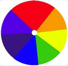
Around 1665, when Isaac Newton passed white light through a prism and watched it fan out into a rainbow, identified seven constituent colors: red, orange, yellow, green, blue, indigo and violet, not necessarily because that's how many shades he saw, but because he thought the colors of the rainbow were analogous to the notes of the scale musical.
It has two characteristics, that the name of the colors it appears on the perimeter, where the hue is located, and that on the perimeter are the pure, saturated colors. Towards the center of the circle, the color is desaturated, becoming white.
Maxwell diagram.
Corrects Newton's error that persisted for 150 years in believing that the basic colors were red, yellow and blue, which are basic colors in pigments but not in lights.
From the previous diagrams another one is elaborated in which the hue is in the perimeter and in the center the saturation is represented. There is a problem in the representation system and it is that of non-spectral colors, which are those that there is no wavelength that reproduces them and they are only obtained by mix other colors.
To predict the result of the mixture we must start from the diagram and see where the x and the Y. The color to be perceived can be the same, the mixture of colors being different from one another physically. They are metameric colors those that are obtained differently but are perceived the same.
Another issue is that the amount that we have to use of each color to obtain another is not always the same, there are several possible mixtures. When the colors that are mixed are opposite, that is, the line that one them is a diameter of the circle, they cancel out one to the other and the white color is obtained which is located in the geometric center of the circle, that is, at the origin. They are complementary colors.
The coordinates of the resulting color are obtained by performing the weighted sum of the colors used, being to Y b the amounts of color we use:
xi = ax1 + bx2 / a + b
yi = ay1 + by2 / a + b
This chromaticity diagram has some drawbacks:
- It does not adequately represent spectral colors.
- Makes wrong predictions when it comes to complementary colors.
Other chromaticity diagrams.
Trichromaticity principle:
Any set of three colors can be used as a set of basic colors, the only thing What is needed is that they are not orthogonal, that none of them can be obtained by mixing the others two. Red, green and blue are used and any color can be obtained in most cases.
Other chromaticity diagrams: Munsell (1925):
It uses a solid that could be visualized as two cones glued together at the base.
It has three axes. The vertical axis represents the brightness (from white to black). This solid could break at any point on the axis, resulting in a circle. In this the perimeter represents nuances and inwards the saturation. The advantage is that it represents the dimension of the gloss and that it is composed of a large number of sheets.
CIE (1931):
It is the most widely used and is based on the curves obtained in various color mixing experiments. In these experiments colors were presented that the subject has to obtain with three basic colors. It was found that there are test colors that are impossible to obtain unless one of the lights is directed into the experimenter's field. The sum of the three coordinates will always be 1. At the perimeter are the wavelengths of the pure colors. As we get closer to a central point, we have less saturation. The non-spectral colors would be located on the imaginary line that would join the two extremes.

Color coding mechanisms.
Trichromatic theory:
Since there are three fundamental colors we can think that there is also three retinal photoreceptors each one in charge of coding a color, sensitive to short, medium and long wavelengths.
David Brewser (1831) was the first to measure color sensitivity curves. Find a peak in the wavelengths of red-orange, green, and blue. From the point of view of sensitivity it seems that there are three maxima.
Young (1802) he wrote: "It is completely impossible to conceive that any point on the retina contains an infinite number of particles, each capable of vibrate in unison with each possible ripple, it is necessary to assume that there is a limited number, for example, to the three colors red, yellow and blue".
Helmholt corrected Young's error by pointing out that the colors were red-orange, green, and blue. These photoreceptors are most sensitive to these colors but they are also most sensitive to others.
How are the shades discriminated?
If they are basic colors this is very simple, they are activated by different photoreceptors. The problem is when they are different shades.
How is brightness encoded?
Brighter colors activate more photoreceptors than dimmer colors. If there is more light intensity there will be more activity.
How is saturation coded?
White increases the activity of all receptors. If green is pure, only the green photoreceptor is activated, if it is desaturated it will activate others, because what we do is add white light.
The metameric colors they produce the equalization of the pattern of activity in the three receptors. The receptors are considered to be activated in the two colors in the same way. Complementary colors equalize activity in all three photoreceptors.
There are three types of photoreceptors with maximum sensitivity 570 nm (reddish-yellow), 535 nm (green) Y 445 nm (blue-violet), but these colors are not basic. This is a weak point of the theory.
Theory of opponent processes:
It was formulated by Hering (1878) and was supported by psychophysical data:
- Color matching: Color nuances are presented and the subject has to use the minimum number of categories to define those colors. Almost everyone uses four, red, yellow, green and blue.
- Color post-effects: Four colored circles are presented and you are asked to look at the center point. It is removed and an effect is produced in which you have the illusion of seeing opposite colors.
- Color vision deficiencies: Those who have problems with the vision of red also have problems with green. Those who mistake blue for a color also mistake yellow for that color. This supports the idea of four colors that are arranged in pairs.
- Impossible mixes: There are mixtures that are difficult to process, with green and red the greens are perceived without color, a dark hue that separates them. The perceived color has no name in any language.
Hering proposes at the retinal level the existence of three receptor systems: one for red-green, another for blue-yellow, and another for white-black. This is physiologically false.
Svaetiche in the middle of the century he found cells in the horizontal cells of the retina that behaved in curious ways. Some had a biphasic response to the green light, it rises and falls, the latter associated with the presence of red. The same found with blue-yellow.
DeValois and Jacobs (1975) discover a similar mechanism in the macaque's visual system. There are several cell systems in the lateral geniculate system that serve the anterior pairs.
A good color theory must be trichromatic at the receptor level, but it must include an opponent mechanism at a higher level.
Retinex theory:
It was formulated by Land, and what it says is that the perceived color of an object is constant even if the degree of luminosity changes. The perceived color on a surface is determined by the wavelengths it reflects, but also by those of the surrounding surfaces. This theory says that the visual system should be based on reflectance rather than luminosity. The visual system performs a comparison between comparisons, which would be done in V4.
This article is merely informative, in Psychology-Online we do not have the power to make a diagnosis or recommend a treatment. We invite you to go to a psychologist to treat your particular case.
If you want to read more articles similar to Color perception - Basic psychology, we recommend that you enter our category of Basic psychology.