As every diagram represents a visual utility toolto represent activities or stages of a certain process or project, however, many do not know what a Gantt chart is and what it consists of.
Before exemplify Gantt charts Let's define what they consist of and what is their usefulness.
Advertisements
In this article you will find:
What is a gantt chart and what is it useful for?
A Gantt diagram is a management tool project process activities, through scheduling or advance planning of the time in which each of the activities will be executed.
In other words, a gantt chart is a schedule of activities.
Advertisements
What is the gantt chart useful for? This type of diagram is useful for time management that involves executing actions or activities of a certain project or process, as this tool facilitates the planning and control of activities scheduled and run time optimization.
How to make a Gantt chart?
Developing a gantt chart is very easy and simple, for this the following steps are used:
Advertisements
- Make a list of tasks:
To have each activity previouslydefined in the order of execution of each one is essential for the diagram to be well done.
For this you can use the Excel tool offered by Microsoft Office or online programs offered by the web.
Advertisements
In the first column "vertical" enter from top to bottom the list with the name of the activities, in the rows "Horizontal" next to each of them lthe time intervals for execution, the start date, the duration time and the end date.
- Create the bars of the diagram:
The main feature of gantt charts is their graphical representation through horizontal bars that allow to represent the execution time of each activity, basically adding color to the time boxes that are intercepted with each activity.
Advertisements
These bars can be created through the same Excel cells entering the data of the activities and the unit of measurement of time (hours, days, weeks, months) that you want to represent and without the need for an internet connection.
Other viable options for creating gantt charts are through web tools, where you can find programs that are tailored to the user's needs.
To make it easier to understand, let's look at the following examples.
1. Gantt chart example using Excel
Gantt charts created through Excel are a very practical way to create a schedule tailored to the activities to be represented, being able to create them from scratch and modify it if desired.
To create a gantt chart through Excel cells can be done as follows, as seen in the image:

In this example we can observe the data of the task list of an audit process of a certain company, before starting to carry out the Gantt chart.
Once we have the data to represent, we proceed to create the diagram that in this particular case we will exemplify how to do it starting from the same cells in Excel. Let's see the following image:

As could be seen in the image in column (A) each of the activities are entered and in the columns successive the stipulated time that the audit process will last counting business days from Monday to Friday in this case.
In the rows from right to left the cells are marked that intercept the activities with the day on which they will be executed and that adding color to them they form bars that allow you to easily view the execution time.
2. Gantt chart example using Excel
In this example, you can observe activities in a marketing process using a Gantt chart to coordinate the duration of the activities.

As can be seen in the following image, the same previous data is represented in a gantt chart, in which it is observed that the estimated time each activity will last is represented by colored cells green, one cell for each day that the process lasts.

These same cells allow to reflect a horizontal graphic display in the form of bars that facilitate the interpretation of the process time lapse.
If an activity spans more or less time than expected only the cell color is modifiedIf necessary, a new column is added to enter a new date.
If required also a new activity can be added by entering a new row.
Although gantt charts They are very useful to represent the execution time of activities, the disadvantage what they have is that it does not reflect the dependency or relationship of the process activities.
3. Gantt chart example using web tools
The web also offers different pages with online services for creating gantt charts that can be edited to suit the user such as Lucidchard, vengage.com, Canva, among many other free and paid options.
In this case we will use Lucidchard tool, for it you only need to register and create a user which offers free services as well as low-cost subscription options.
In the free option we can see the following example image:
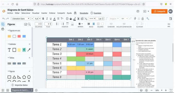
As you can see, it offers editing options very similar to those offered by Excel, where you can add rows and columns, combine and color cells, among other options.
In this case we can see that in a gantt chart not necessarily the colors of each activity should be the same, this is at the discretion of the creator.
Similarly, several activities can be carried out on the same day at different times and even at the same time if it involves teamwork, for thethat coloring each activity in a different color in these cases turns out to be very practical, the important thing is that it is functional to coordinate the activities.