A scatter diagram is a graphic representation in which the correlation that exists between two variables can be known using the plane. Cartesian, being very useful to determine and represent the correlation that exists between the data of two study variables, such as the relationship between cause and effect.
Scatterplots is a representation of variables in the Cartesian plane using quantitative data.
In this article you will find:
What is a scatterplot and what is it useful for?
A scatterplot is a type of graphical representation in which it is possible to know the correlation that exists between two variables making use of the Cartesian plane, for this the values or data of the variables are assigned to the axes (X, Y) and each intersection between both variables represents a point on the graph of the flat.
Advertisements
These points together are displayed as a cloud of points, which represent the scatterplot.

Advertisements
What is a scatterplot useful for? This dispersion diagram is very useful to be able to determine and represent the correlation that exists between the data of two study variables, such as relationships between cause and effect or relationships between causes.
This type of diagram It is widely implemented in applied statistics, as in economics and also in marketing, since it helps companies to understand important market data, although its field of application can be very varied.
Advertisements
Steps to make a scatterplot
Although making a scatterplot is a simple process, we must take into account the following steps:
- Define the situation whose determinants you want to represent in the diagram.
- Collect the data of these factors, the data must be representative of the situation, in which both variables must have the same amount of sample data.
- Identify the variables, on the (Y) axis the dependent variable, this represents the factor whose behavior is influenced by the other variable, this other being the independent variable that is represented on the (X) axis.
- Represent the values of each variable on the graph and mark with a dot the intersection of the data on the (Y) axis with those on the (X) axis.
- Analysis of the dispersion data represented in the graph to determine the correlation exists.
Linear correlation in the analysis of scatterplots
linear correlations on scatterplots allow us to interpret the intensity with which both variables are related to each other, In this sense, a correlation can be:
Advertisements
- positive correlation: represents that both variables have an increasing behavior, if one increases the other also.
-
Negative correlation: in this representation as one variable increases, the other decreases.
null correlation: there is no correlation between both variables.
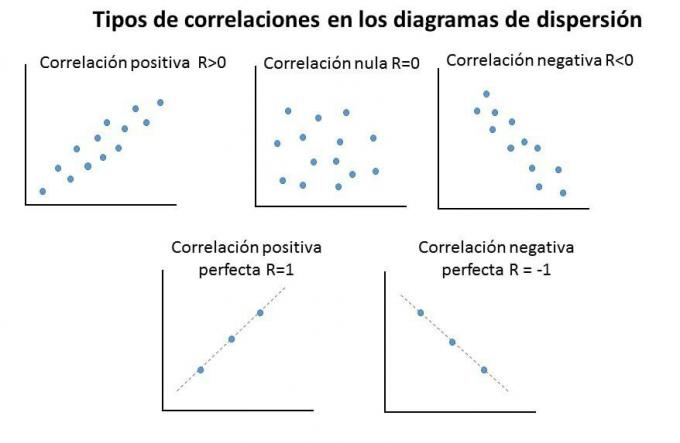
Nevertheless, a correlation is ideal or perfect as the correlations between both variables have an equally proportional behavior, with a correlation coefficient equal to one.
Advertisements
if we want accurately determine the correlation coefficient, in Excel can add the formulas default “=COEFF.DE.CORREL(…,..)” You just have to insert the formula, drag the data from the first variable, put a comma in it, drag the data from the second variable and that's it.
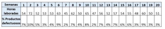
1. Scatter Plot Example
In this example, a company wants to know the relationship between the number of hours worked and the number of defective products, for this the company carried out a study for 20 weeks, said follow-up yielded the following data:
Once the necessary data has been identified, we proceed to the graphic representation.For this, it is necessary to identify which of the factors represents the dependent variable and which represents the independent variable.
We can identify that the hours worked are the independent variable represented on the (X) axis and the defective products the dependent which is always reflected in the (y) axis.
We see the data represented in the graph:
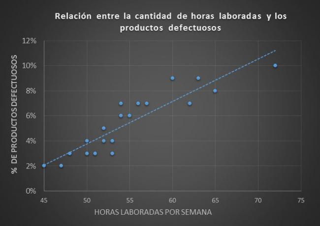
As shown in the graph, the relationships between the collected data is reflected with scattered blue dots, each point represents the relationship of hours worked and the defective products presented per week.
To the add a trend line to the graph we can define that In this graph there is a positive correlation, because as the working hours increase the percentage of defective products also increases.
This trend line represents a correlation coefficient of 0.91.
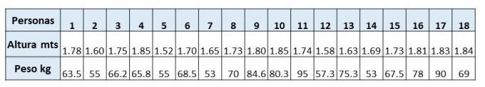
2. Scatter Plot Example
In this case, we seek to know if there is a relationship between weight and height of 18 randomly selected people in a given locality, it should be noted that the more data collected, the more representative the sample is of the conditions of the total population; Let's see the data:
Let's look at the representation in the scatterplot:

As seen in the diagram, there is an intermediate positive correlation, because the height, although it affects the weight, its incidence is not very high, whose correlation coefficient is 0.59.
For the elaboration of the diagram we can use Microsoft Office Excel as a tool, we just go to the Excel toolbar and insert the scatterplot and add the necessary data to it.