The Pareto diagram is a type of diagram that allows assigning values to a graph and ordering them from highest to lowest, it is based on the law of Pareto 80/20, also known as ABC distribution curve, since it allows to identify priorities in percentages, group A 80%, B and C the 20%.
These Pareto charts, also known as the ABC distribution curve, are a very useful management tool, allowing prioritizing actions in decision making.
In this article you will find:
What is a Pareto chart and what is it useful for?
A Pareto chart is a type of chart that allows you to assign values to a graph and order them from highest to lowest, to represent the level of priority or affectation of each value in decision making.
Advertisements
This graphic representation is based on the Pareto 80/20 law, which indicates that in 80% of the results 20% of the efforts intervene, or that 80% of the consequences are derived from 20% of causative elements.
What is the Pareto chart useful for? This graphic representation allows to represent the measurement of results in different areas, as it is in business management, to determine in which areas or items it is necessary to generate greater efforts.
Advertisements
Basically, it is useful for assigning priority to those products or problems that have the greatest impact in the area in which they operate.
1. Pareto Chart Example
In this example, a Pareto chart that allows to analyze in which products the company Electrohogar C.A. has to focus on greater medical investments to generate higher profits.
Advertisements
For this, it is necessary for the company to verify the merchandise exits from the inventory and the cost of said products.
Once the necessary information is obtained, a table with the corresponding data in Microsoft Office Excel, as shown in the following image:
Advertisements
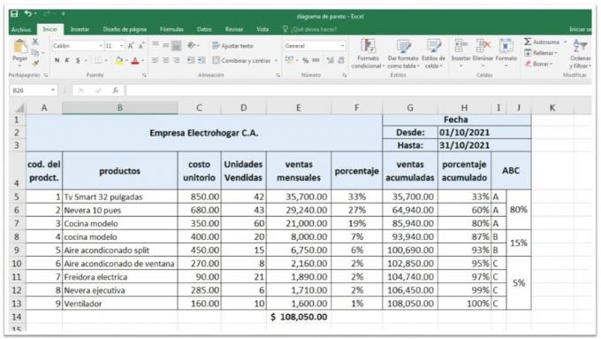
To create the table, you must enter the description of each product, unit cost and units sold during the period to be analysed, in this case, sales during the month of November.
Advertisements
Once the data is represented, we proceed to carry out the corresponding calculations and their representation in the diagramFor this, we carry out the following procedures:
- In column (E), the unit cost is multiplied by the units sold of each product and then an autosum is made to know the amount of all sales.
- In the column (F), for him percentage calculation a division is made between the total of each product sold and the global amount of sales, and we represent it in percentages.
- Once the calculation is done we go to the toolbar “sort and filter” We access the custom order option, order by percentages from highest to lowest, this will allow the products with the highest percentage of sales to be positioned in descending order.
- In column (G), The calculation consists of adding each total sale by product with the total of the next one and so on until accumulating the global amount of products sold.
- In column (H), the calculation is done in the same way as with the commune (G) except that this is the cumulative of the sales percentages.
- In the columns (I, J), are classified the sales volume at ABC, A to represent the products that generate 80% of sales, B for 15% and C for 5%.
By having all the values previously calculated in the same sheet of Microsoft Office Excel, we make the Pareto chart entering the value of the sales and the percentages.
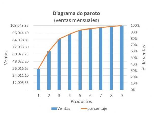
In this case, 3 of its products represent 80% of the month's earnings, therefore, the company must focus its investments on maintaining a greater inventory of these three products, qualifying them as priority "A".
Nevertheless, the remaining 20% can be divided into two parts, group "B" for the products representing 15% which are of medium importance and a group “C” of 5% for those in which it is not necessary to make large investments or rigorous inventory management.
Therefore, if three types of products are responsible for 80% of sales, 6 are responsible for 20%.
2. Pareto Chart Example
In this case, a Pareto diagram to identify which are the failures that are most frequently generated in the production processes.
In this way, applying the Pareto diagram, it will be possible to assign greater relevance to those failures that occurred more frequently. in a period of six months, allowing the company to correct the failures according to their order of importance.
For it we identify each of the failures presented and thewe represent in a table of Excehe as follows:
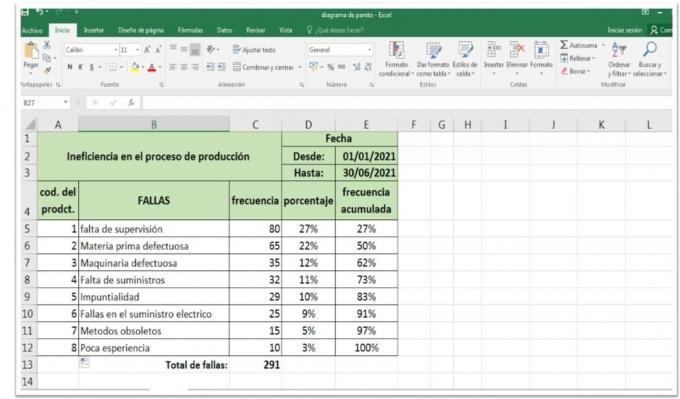
Having the data in the table, we proceed to calculate the percentage with which said failures are presented and the order from largest to smallest, being the first percentages the most frequent failures.
After percentage, in the next column we add the percentages of each failure cumulatively until completing the last cell and whose value must be equal to 100%.
Once we have the data ready, we proceed to carry out the Pareto chart inserting a column chart and adding the corresponding data, as shown in the following image:
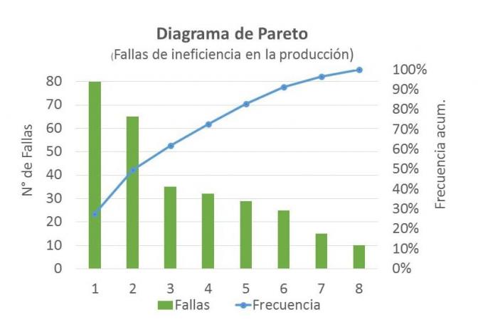
As can be seen in the graph of the Pareto diagram on the failures that cause inefficiency in the production processes, the first two failures were generated with a frequency of 65 and 80 times, which is equivalent to 50% of the total failures.
In this sense, the stocks of these first two faults represent for the company the failures with the highest priority to be corrected, since they are responsible for half of the inefficiency problems generated in production.
"As observed Pareto's law, does not necessarily imply that the 80/20 ratio is an exact rule, Well, what it seeks is to represent that a small proportion is equivalent to a larger one, since the greater consequence of a failure is equivalent to others of lesser affectation. “